MDC
MDC stand for MarkDown Components extended syntax, it expand the edge of the ability of Markdown by embedding the Vue components.
There are two types of MDC:
- Inline MDC: it starts with
:identifier and the name of the MDC should be followed after it. The Inline MDC cannot contain any content. - Block MDC: it's wrapped with the
::identifier, and the name of the MDC should be followed after the first::identifier. The Block MDC can contain some content between the::identifier.
Both of the two types MDC can accept properties for customization. The properties are placed inside the curly brackets with the key-value format {key="value"}
Tip
Please notice that the data type of the property value should be string.
You can check out the Nuxt Content documentation to learn more about MDC syntax.
BlogiNote provide some build-in MDC, this tutorial will show you how to use them.
TabGroup
This Block MDC will generate a multiple tabs container.
For example
this is the first tab
This Block MDC should be used with another Block MDC TabItem inside it.
the content in markdown file of the example shown above is
::TabGroup
::::TabItem{name="Tab1"}
this is the first tab
::::

::::TabItem{name="Tab1"}
this is second tab
::::

::::TabItem{name="Tab3"}
this is third tab
::::
::
Each Block MDC TabItem will wrap the content of a tab, and it has an optional name property to setup the tab name shown at the header (the default tab name is Tab).
This MDC is designed for showing content side by side, I like to use it to demonstrate how to write content in markdown in the Markdown tab and show the parse result in Result tab, like this:
Markdown file extension name is .md
IconCustom
This Inline MDC will generate an icon
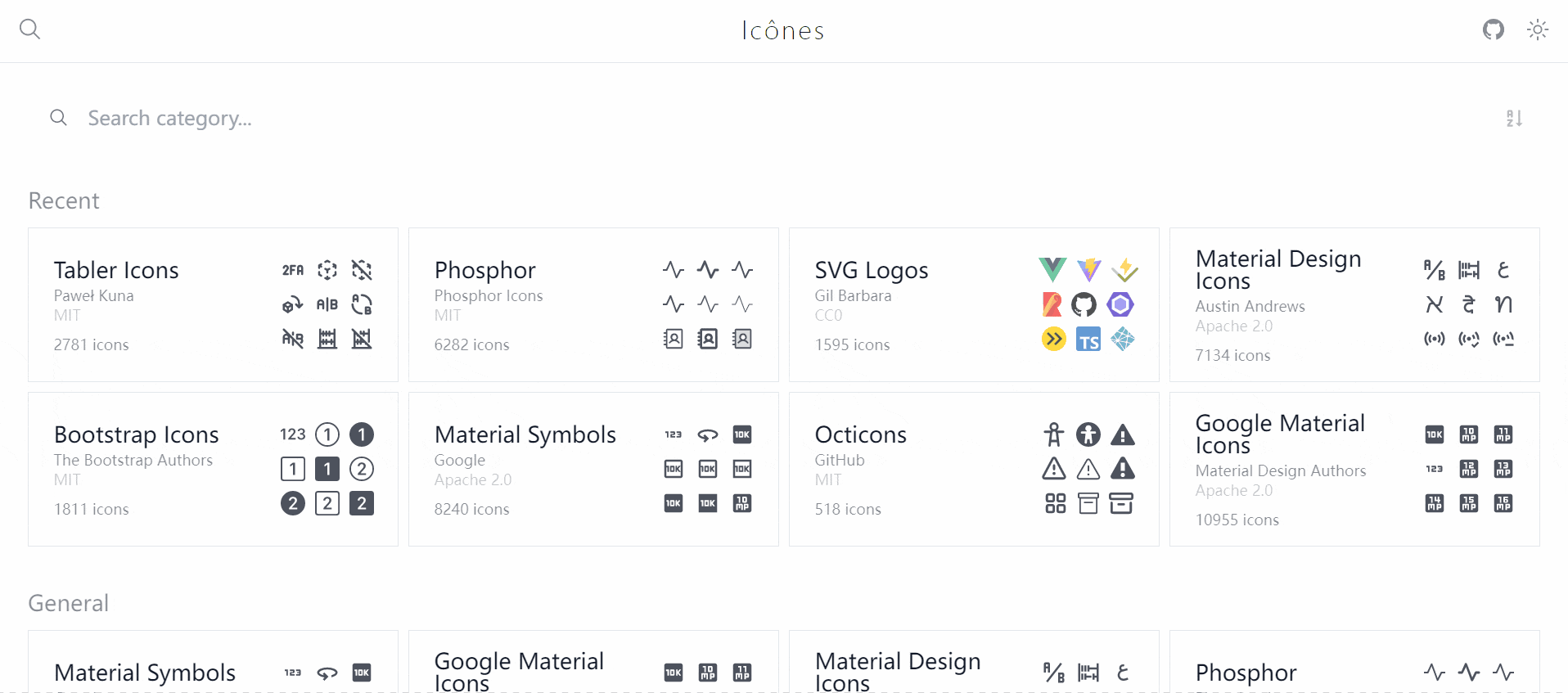
IconCustom must have the name property to setup which icon should be shown, the string value represents a icon, you can find all the supported icon names at Icônes
There is an optional properties iconClass for adding the CSS class for the icon, you can add Tailwind CSS utility class to style the icon
For example setting the icon size to 24px x 24px, and setting the color to purple
TipBox
This Block MDC will generate a colorful box to show some tips.
For example
Tip
This is an example TipBox
TipBox support the following (optional) properties:
typeproperty: there are some build-in types for special use casestipannouncewarningfunachievequestiongoodbad
for example thewarningtype will show a red boxWarning
This is warning type
Tip
This is a tip
iconproperty: set the small icon
you can find the supported icon names at Icônes
for example setting a smile face as the iconTip
this TipBox has a smile face icon
nameproperty: set the title
for example setting the title asexampleexample
this TipBox with a title as example
boxStyleproperty: set the CSS Style for the TipBox container
there are some properties for styling the TipBox background color, text color or border color
For example setting a colorful TipBox with orange (use the hex format) background `background-color: #ffa500`, white (use the name of the color) text `color: white` and blue (use the rgba format) border `border-color: rgba(0, 0, 255, 1)`

::TabGroup
::::TabItem{name="Result"}
::::::TipBox{boxStyle="background-color: #ffa500; color: whit; border-color: rgba(0, 0, 255, 1)"}
a colorful TipBox
::::::
::::

::::TabItem{name="Markdown"}
```md
::TipBox{boxStyle="background-color: #ffa500; color: whit; border-color: rgba(0, 0, 255, 1)"}
a colorful TipBox
::
```
::::
::
boxClassproperty: set the CSS Class for the TipBox container
BlogiNote support Tailwind CSS, so you can also use it to set the style of the TipBox
For example setting a similar colorful TipBox as aboveTip
a colorful TipBox
- open property: set whether the TipBox is initially expanded or collapsed (this only sets the initial state of the TipBox when the page is first loaded. You can still manually expand or collapse the content of TipBox by clicking the icon or title at the top-right corner of the TipBox).
The default initial state is expanded, which is setting the property asopen="true". The following TipBox will have initial state set to collapsed.Tip
this TipBox initial state is collapsed
ImageList
This is a Block MDC, it will generate a container for a list of images with a thumbnails sidebar.
It's more convenient to show and browser a batch of images collection using this component.
For example the following markdown content will generate a image list
::ImageList{height='500px'}


::
ImageList can accept the (optional) height property to set the height of this component, the default height is 400px